Just want the code? Here’s the git repository

If you want to maintain total control over the code and design choices on your site, it’s important to use as few plugins as possible! Creating your own components not only gives you total control, but it allows you to keep your http requests low, and reduces the amount of data required to load your site.

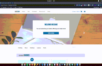
A popular component on many websites is the Hero Slider. These are great for supporting your branding and quickly conveying bits of information, like upcoming events, sales, mailing list forms, and so on. They also tend to be extremely bulky plugins, as they load boatloads of css and javascript in order to support their many customizations.

There are many ways to create your own, and a number of great libraries like swiper and tinyslider, but the most efficient way is to build your own! Personally, I like to have a library of my own components, that way I can easily re-use and modify them for quickly setting up new sites and being able to easily tailor and extend them to add the required form and functionality.

So enough rambling, let’s start working on our no plugin image slider! I’m going to demonstrate the barebones HTML, CSS, and Javascript required, as well as how to implement this in WordPress.

Step 1: The Structure

First, lets set up the basic HTML we’ll need to accomplish this. We’ll need two divs, one to act as the wrapper, and one to contain each of our slides. The first div will hide the overflow with a set width and overflow hidden, while the second will have width:auto; and overflow the screen to contain each of our slides. We can add a couple of demo slides inside as well.

<div class="slider-wrapper">
      <div id="slider" class="slider transition">
        <div class="slide">1 <img src="img.jpg" /></div>
        <div class="slide">2 <img src="img2.jpg" /></div>
        <div class="slide">3 <img src="img3.jpg" /></div>
      </div>
</div>

Now for the styling. The width of the slider-wrapper is up to you, but you should set your .slide class to the same width in order to have each one fill the width of the container div. I’ve added borders to the .slider and .slide classes just so that you can verify the width of the elements while building out the slider. I’ve also set the initial transform of the .slider to transform:translateX(-90vw), we’ll discuss that in a second.

 .slider-wrapper {
        width: 90vw;
        margin: auto;
        overflow: hidden;
      }
      .slider {
        width: auto;
        height: 80vh;
        margin: auto;
        display: flex;

        border: 2px solid black;
        transform: translateX(-90vw);
      }
      .slide {
        width: 90vw;
        background: grey;
        height: 30vh;
        border: 1px solid red;
        flex: 1 0 auto;
      }

  .transition {
        -webkit-transition: 0.3s all;
        -moz-transition: 0.3s all;
        -o-transition: 0.3s all;
        transition: 0.3s all;
      }
      .notransition {
        -webkit-transition: none !important;
        -moz-transition: none !important;
        -o-transition: none !important;
        transition: none !important;
      }

Great! Now we need some buttons.

 <div class="slider-controls">
      <p id="slider-left" onclick="left()">left</p>
      <p id="slider-right" onclick="right()">right</p>
    </div>

You can swap out ‘left’ and ‘right’ for icons, carats, or whatever makes you feel good.

Step 2: The JavaScript

Okay so we have our structure set up, now we need to make it move! We’ll need to access some of the HTML elements we just set up, so lets grab them first

var slideRight = document.getElementById("slider-right");
var slideLeft = document.getElementById("slider-left");
var theSlider = document.getElementById("slider");
var slides = document.getElementsByClassName("slide");

and we’ll need some additional variables to help us keep track of a few things

//get number of slides
 var count = slides.length;
//set your start position to 2
 var position = 2;

The count will allow us to track our position among the number of slides we’ve created, and we’re setting our start position to 2 so that we start from the second slide. Why?

Well, in order to get a smooth, infinite scroll from the last slide to the first slide and vice versa, we’re going to need to duplicate our first and last slides and append them to opposite sides of our slider.

With duplicates, we can animate our transition back to the first and last slides, remove our transition effect, jump back to the actual start/end of the slider, and then re-enable our transition so that we can continue on with our smooth slide movement.

So, lets append a duplicate of our first slide to the end, and a duplicate of our last slide to the front.

//get the last slide first so that you aren't copying the first slide twice
 var newChild = slides[slides.length - 1];
//append copy of last slide to front, and copy of first slide to end
 theSlider.innerHTML =
     newChild.outerHTML + theSlider.innerHTML + slides[0].outerHTML;

Now we need to get things moving! We’ll need to write two functions to handle movement of the slides to the left and right. Lets write our right movement function first.

   function right() {
        console.log("position: " + position + " count: " + count);

        if (position <= count) {
          console.log("right, position<=count");

          theSlider.style.transform = `translateX(-${9 * position}0vw)`;
          position++;
        } else if (position > count) {
          console.log("right, position >count");

          theSlider.style.transform = `translateX(-${9 * position}0vw)`;
          setTimeout(function () {
            theSlider.classList.remove("transition");
            theSlider.classList.add("notransition");

            theSlider.style.transform = "translateX(-90vw)";
          }, 300);

          setTimeout(function () {
            theSlider.classList.add("transition");
            theSlider.classList.remove("notransition");
          }, 600);
          position = 2;
        }
        console.log("position: " + position + " count: " + count);
        return position;
      }

I added some console.logs for debugging, so that you can check that your code is running when expected. You can remove those if everything’s working!

We have an if/else statement to handle two scenarios, when position <= count and what to do otherwise. this will allow us to handle normal movement, as well as transitioning from the end of the slider, back to the front of the slider, seamlessly.

Regular movement is straightforward, but the seamless transition is where it gets fun! We’re using two setTimeouts, one at 300ms and one a 600ms, (this mirrors the transition speed, so adjust if you set a longer or shorter transition) in order to allow our slider to transition to the duplicate at the end, remove its transition style, jump back to the front of the slider, and then re-enable transitions. Viola!

We’ll do the same thing for our left movement, but for the opposite direction

 function left() {
        if (position > 2) {
          console.log("left, position >=2");
          position--;
          if (position == 1) {
            theSlider.style.transform = `translateX(0vw)`;
            position = slides.length - 2;
            setTimeout(function () {
              theSlider.classList.remove("transition");
              theSlider.classList.add("notransition");
              theSlider.style.transform = `translateX(-${9 * position}0vw)`;
            }, 300);

            setTimeout(function () {
              theSlider.classList.add("transition");
              theSlider.classList.remove("notransition");
            }, 600);
          } else {
            theSlider.style.transform = `translateX(-${9 * position}0vw)`;
          }
        } else if (position < 2) {
          console.log("left, position <=2");
          position = slides.length - 2;
          theSlider.style.transform = `translateX(0vw)`;
          setTimeout(function () {
            theSlider.classList.remove("transition");
            theSlider.classList.add("notransition");

            console.log(position);
            theSlider.style.transform = `translateX(-${9 * position}0vw)`;
          }, 300);

          setTimeout(function () {
            theSlider.classList.add("transition");
            theSlider.classList.remove("notransition");
          }, 600);
        } else if (position == 2) {
          position--;
          theSlider.style.transform = `translateX(-${9 * position}0vw)`;
        }
        console.log("position: " + position + " count: " + count);
        lastClicked = left;
        return position, lastClicked;
      }

Now just set an Interval on the right function if you want automatic transitioning, and you’re good to go!

Step 3: WordPress

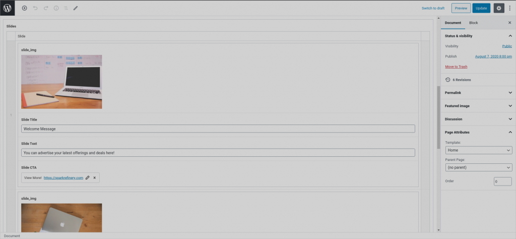
With Advanced Custom Fields Pro, you can make a really nice, dynamic slider! I’ve included an export of my field group in the repo if you’d like to implement it. I have things grouped for future extensibility, so I can add new groups with different fields/styles down the road.

Your CSS and Javascript will be largely the same, but with a repeater you can dynamically add and remove slides, which will result in an easy to use back-end interface which can be used on any page. The best way to make this easily re-usable would be to create a template part, and then simply use get_template_part() to implement it on the page templates you want it to appear on.

Obviously the iPad is not the ideal device for development. There’s no support for a native console, no way to install NPM or spin up a local web server, and there’s no official native support for that sort of thing in sight (except kind of? We’ll get to that later!).

HOWEVER, I’ve always been fascinated with trying to do more with less. And I love the form factor and UI of the iPad. So naturally, I’ve always been on the hunt for productivity apps that can help me get as close to possible to iPad development, and I‘ve put together a pretty killer lineup of applications that you can use to build out an entire website straight from a base model iPad if you really want to torture yourself.

Step 1: Local Dev


Believe it or not, you can do some basic local web development with the iPad. There are numerous text editors that provide WebDAV URL setup, which will set up your files on a local server that you can then run right on the browser of your choice. When paired with the Inspect app, this a nearly full-featured editing experience! You can edit your files in your text editor, and access them locally with Inspect in order to debug. WebDAV is just a file server, so it won’t allow you to install any tools to say, host a WordPress site locally, or set up node, but it will allow you to mess with some quick JavaScript snippets or set up a basic website. And honestly, with the growing trend of moving away from frameworks for more basic functionality, you can set up a pretty solid website just using tools like tailwindcss and alpine.js!

Unfortunately, I ran into an issue with Inspect where it would not prompt for the password, and go straight to 401 unauthorized, which means it won’t work with some text editors like Textastic. However, Code Editor by Panic provides this functionality without any login credentials, which will allow you to develop locally and debug with Inspect!

Step 2: Terminus

For more serious development, Terminus is the base of operations for our iPad development setup. Like I mentioned, there’s no way to set up local servers or do any real LOCAL development on the iPad. But, thanks to dirt cheap remote server options like AWS or digitalocean, you can spin up an instance for around $5 a month to SSH into and serve as your development server. Terminus offers that SSH functionality and provides a great interface for saving connection details, a well thought out terminal environment, and even the ability to use SFTP to pull and push files so that you can use local text editors if you don’t want to mess with nano, vim, or any of those terminal based editors.

What’s great: You can run just about anything you could on a computer on this remote instance. That means if you’re writing a react app, you can run your dev server and check your output live through your iPad browser of choice! I’ve even managed to set up Lando and get an entire WordPress dev environment running off one of these base config DO Droplets!

What’s not so great: Apple restricts background App functionality to only about a minute or so, which means if you spin up your dev server and swap over to, say, split view with a text editor and a browser, terminus will time out rather quickly, which will kill any server you had running. I’ve had some success mitigating this via a mosh connection, but it’s still not perfect, and there are no real workarounds that I’m aware of other than keeping terminus in the foreground either in split-view, or as a slide-out app on top of your other one or two open applications.

Step 3: Text Editors

There are a few text editors native to the iPad that have some great features. I personally used coda (code editor by Panic) for a while, but found that it’s syntax highlighting was pretty limited. It is useful however for its no-login WebDAV config in order to use it with Inspect.

Textastic has support for just about any language you can think of, and allows you to pull and push files via SFTP. It also has SSh functionality of its own similar to terminus, but I’ve found terminus is a little bit cleaner and easier to navigate for that.

When I’m making multiple changes to a project from my iPad, Textastic is my method of choice for readability and quick download/upload capabilities.

Step 4: Inspect Browser by Parallax Dynamics, Inc.

For some reason, none of the major web browsers on iPad have any kind of dev tools built in. This is a major bummer, especially if you’re trying to use your iPad as a dedicated development device. However, you’re not out of luck. A company called Parallax Dynamics, Inc. has released Inspect Browser for the iPad which brings basic chrome devtools-like inspect functionality to the iPad browser!

This amazing app comes packed with a console, an inspect tool, as well as storage, network, resources and source tabs that mimic those that you would find in Chrome DevTools.

You can also emulate different screen sizes, so you can test your deign for mobile, tablet and desktop screens right from the iPad.

Summary

I’m not going to pretend the iPad has replaced my MacBook or my desktop as my main dev machine. The bottom line is even with an external keyboard and the newly added mouse support, it’s not the greatest experience. Limited screen real estate and software limitations makes iPad development a clunky experience at best, and down right frustrating at its worst. But if you’re someone who gets a kick out of doing things the hard way, or you’d just like to have a secondary/backup dev machine for quick on-the-go edits, these apps make the iPad a great candidate for that.

Pagespeed is essential for your customers, and ultimately your bottom line. Nothing will lose someones attention faster than a slow site, and literally every second counts. Google insists that every second of load time takes 12% off of your websites conversion rate!

Needless to say, I take load times seriously, and I’m sure you do too!

One often overlooked but absolutely essential aspect of site optimization lies in the images. Even after cropping and compressing your images, I’m sure you’ve run into the warning on your speed tests that you should be serving images in next-gen formats.

Unfortunately, WordPress doesn’t yet support next-gen formats like WebP, jpeg 2000 or jpeg XR, so this can be a bit of a hassle. WebP Express gets around this by converting existing media library images, and creating rewrite rules in the .htaccess file to redirect requested .jpeg and .png files to their webp versions. This does mean that nginx based servers will need some careful workarounds, so make sure you know what kind of server you’re running before attempting to set up the plugin!

Without a CDN, WebP Express is a breeze to install. It worked right out of the box for me without having to mess with too many settings.

With a CDN, your mileage may vary. It does have CDN friendly options, however I failed to get it working properly with images hosted on DigitalOcean Spaces.

Ultimately, a CDN will also help to dramatically speed up your site, so it may be worth it to invest in a service with on the fly image conversion such as BunnyCDN or one of the paid cloudflare plans. However, if you’re just looking for the finishing touches on your image optimization, WebP Express is an amazing plugin to get you to the finish line and dramatically bump up your pagespeed!

For a quick, thorough guide on setting up this great little plugin, check out this youtube video!

Tailwindcss is an amazing low-level css framework that allows you to build custom designs while serving incredibly small stylesheet files. Taken straight from their website,

Tailwind CSS is a highly customizable, low-level CSS framework that gives you all of the building blocks you need to build bespoke designs without any annoying opinionated styles you have to fight to override.

Instead of complex components, tailwind is a framework of base CSS styles baked into their own classes, which removes the complexity and bulk associated with other css frameworks that aim to build their own complicated components. With the power of PurgeCSS, any unused classes are removed from your final production stylesheet, which leaves you with a stylesheet taking up mere kilobytes.

In this post, I want to discuss how I set it up using another fantastic tool, wpgulp, in order to extend my local WordPress development environment and begin building ultra-lean WordPress sites with Tailwindcss!

Step 1: Install WP gulp

This is fairly straightforward. Navigate to your theme folder, and run npx wpgulp . There is some minimal configuration associated with wpgulp inside the wpgulp.config.js file. You’ll have to change your projectURL to match your local URL, and ensure the paths to all your assets are mapped correctly. It’s very simple, and thewpgulp repository readme provides you with everything you need to know to get up and running in minutes.

Step 2: Install additional dependencies

You’ll need a few more packages to get up and running. Install the following:

npm install —save-dev gulp-postcss tailwindcss

Inside your main sass file, you’ll need to import tailwind via:

@tailwind base;
@tailwind components;
@tailwind utilities;

And finally npx tailwind init to set up your tailwind.config.js file. This will present you with a boilerplate config file to customize your tailwind theme. Here, you will want to add a couple lines to the purge section,

module.exports = {
    purge: {
        // enabled: true,
        content: [“./*.php”, “./**/*.php”],
    },
    theme: {
    extend: {},
    },
    variants: {},
    plugins: [],
};

You will notice that the line // enabled:true is commented out. This line will purge all unused classes from your final stylesheet, which is only necessary when you’re done modifying your styles and ready to push to production. Leaving this uncommented will slow down compile times and require you to recompile if you end up needing to add a class that has been purged, so leave it commented out until you’re done making changes!

The content line is telling the script which files to look at, so add any paths/file extensions in which you’re using tailwind.

Step 3: Modify your gulp file

Wpgulp configures your gulpfile for you, but you’ll need to add a few lines so that it can utilize postcss and tailwind correctly.

Upon inspection, you will find a list of imported plugins for css, utility, and more. Start by importing tailwind and the gulp-postcss packages we installed earlier:

const postcss = require( ‘gulp-postcss’ );
const tailwindcss = require( ‘tailwindcss’ );

Finally, we’ll need to add them to the gulp tasks that generate our stylesheets. You will find two distinct functions, a styles task and a stylesRTL task. Inside each of them respectively, add:

gulp.task(“styles”, () => {
return gulp
…
.pipe(postcss([tailwindcss(“tailwind.config.js”),require(“autoprefixer”)]))
…

And

gulp.task(“stylesRTL”, () => {
return gulp
…
.pipe(postcss([tailwindcss(“tailwind.config.js”), require(“autoprefixer”)]))
…

Step 4: Get Building!

With that, you should be ready to start building with tailwindcss! run npm start and you’re off to the races. You can check out some of their pre-built components to get started, and run through their documentation to get up to speed on their class naming conventions. Once you get the hang of it, you’ll never want to let it go!

It can be tricky trying to migrate a website. Not only do you need to move the site files, but you also need to export the database, and potentially do a search and replace to update all of your permalinks if you’re changing URLs or moving to a local environment to make edits.

While it’s certainly doable without a plugin, it’s sometimes not worth the hassle. Downloading an entire site with S/FTP takes forever. SSH moves more quickly, but you may not have access to that depending on your hosting setup.

Enter WP All-In-One Migration! This plugin handles everything for you, allowing you to save your export to a single *.wpress file for one click imports and exports. It handles everything, including your database.

Grab the Import Extension

Out of the box, you will be limited to a very small maximum file size for your imports, but there is a free extension to bump that up to 512mb. This should cover most basic websites.

They also offer personal and business plans to cover unlimited import file sizes, which you can look into here. For personal use on a single website, a lifetime fee of $69 isn’t too bad, but that business plan is a little steep at $29/month, so you’ll have to consider your ROI if you’re going to be using it to help you run your business.

Manage Your File Size

If you’re struggling to stay within the restriction of your free plan, you have some options for reducing filesize. On the export page, there is a dropdown for advanced options that you can experiment with. The most obvious choice is to ignore any unused themes if you have more than one installed. The media library is another option that can save you a ton of space, and can be migrated separately without too much trouble.

Extending Functionality

For developers, you should know that you can extend these advanced options by adding the following filter to your functions.php file!

add_filter( 'ai1wm_exclude_content_from_export', function( $exclude )
{ $exclude[] = '/path-to-exclude/'; return $exclude; } );

All-in-one will export anything inside your wp-content folder, so this filter allows you to designate folders to exclude from your export. This is helpful for keeping your site size small by ignoring any config files that aren’t necessary for your production build. A great use cse for this is to ignore your node_modules directory if you’re using any local dev tools, or to ignore your sass files and only include your compiled stylesheet.

If you have a small site and need to migrate it between development, production, or from one host to another, WP All-In-One Migration can save you a ton of time!

The first step in setting up any website is figuring out your hosting. There are countless options for hosting providers, which makes picking the right one a daunting task! In this article, I’m going to provide a number of options that may work for you depending on your situation.  In general, you will find that cheaper options will provide you with more freedom, but also more responsibility. More expensive services tend to do a lot of the heavy lifting for you and provide great support, but will charge a premium. Each of the recommendations on the list are great, but only if they match your use case specifically. So let’s take a look at some options!

WPEngine

I’m going to start this list with WPEngine because I have the most experience managing WordPress sites with them.

 Plans start at $30/mo, which will get you 25,000 visitsmonth, 10gb storage, 50gb bandwidthmonth,  and 1 site

 While you will certainly pay a premium with WPEngine, it is one of the most convenient solutions out there. They provide One Click setup for your websites, which will include development, staging, and production environments, to allow you to easily test changes before pushing them live.  

Once your site is live, they also provide automated backups and one click SSL encryption at no additional charge which will auto-renew for you, meaning you won’t have to keep track of that pesky expiration date. 

 They have nearly automated domain transfers for a number of different domain providers including godaddy, which will take much of the headache out of transferring your domain, and their support is incredible. I have never had an issue that WPEngine support could not provide a solution to, or provide me with the relevant information I needed to fix myself.  

WPEngine even offers 37 premium themes for free to all of their users, which can help to cut costs and kickstart a new project if you aren’t looking to build one yourself.

Kinsta

Kinsta offers many of the same benefits as WPEngine, but do provide some of their own perks. You’ll have more options for which PHP version you’d like to run, great auto-scaling infrastructure to handle sudden surges in traffic, SSH, Git, and WP-CLI access on all plans, and global data centers for more reliably fast load times.

DigitalOcean

DigitalOcean is what I use to host spark refinery. With droplets starting at just $5/mo, you can’t do much better for an entry level hosting provider. Much like AWS, DigitalOcean provides a number of starting configurations for your droplet, with different operating systems, resource allocations, and server locations. There is even a one click solution for setting up a WordPress environment, so you can skip all the nitty gritty and get to managing your site right away!

 They offer regular backups for a small premium, some monitoring tools, and networking tools to connect your domains and manage DNS records, floating IPs, and more. 

 Much like AWS and other low-level services, they also provide quick and easy scalability for your droplets, so that you can increase space and resources as your website grows. 

Whatever you do, avoid EIG Hosts!

Endurance International Group is a company known for buying up reputable hosting providers and driving them into the ground. These include big, nearly household names such as HostGator and BlueHost. 

For an in-depth read on why you should avoid them and an updated list of their child acquisitions, look to reviewhell’s excellent review on the subject here

Of course, these are not your only options! Do your own research, and figure out what’s right for you! And if you’d like some help deciding, leave a comment or a message!

Need some personal help?
Drop us a line!